
Everything Artsy · Creative Resource Library
A rich visual vocabulary.
Welcome, creative souls. A streak of ochre beside a deep blue can change the whole feeling of a painting. This library begins with moments like that. Come look closely, try something at your own worktable, and see where your eye takes you.
Explore the collections ↓
Discover
Look for the detail that holds your eye. A rough edge, a repeated line, two colors touching.
Explore
Bring it to your sketchbook. Change its scale, turn it sideways, or paint a layer over it.
Expand
Keep a scrap of the version you love. Write down what changed so you can find your way back to it.
The Artist’s Inspiration Wall
Explore the Collections
Six ways into the studio. Start with the piece that makes you want to look closer.
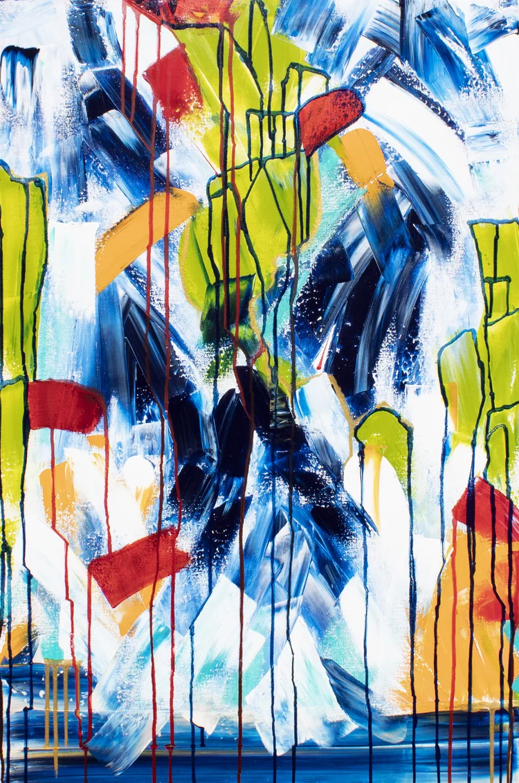
Color & Relationships
Explore the atlas →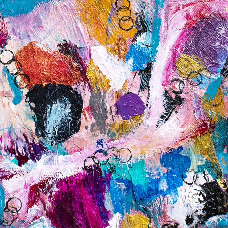
Texture & Surfaces
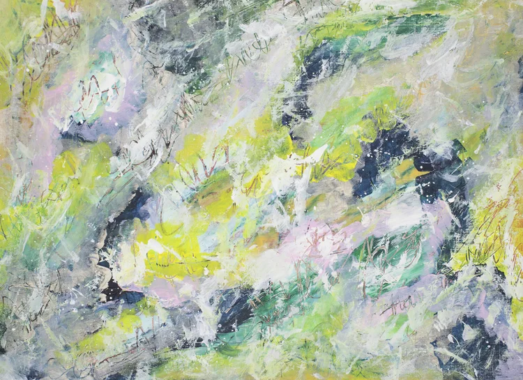
Marks & Expression
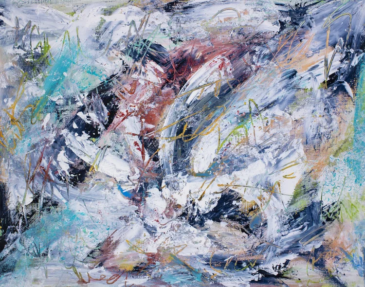
Composition & Energy
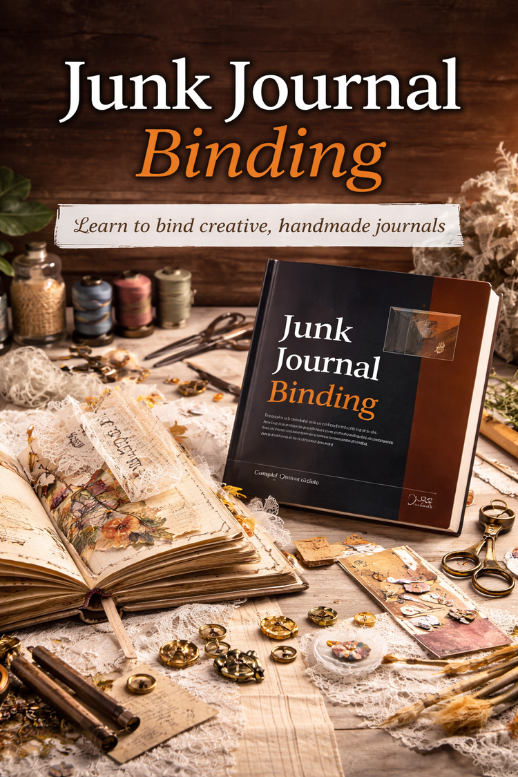
Materials & Processes
Junk journal binding →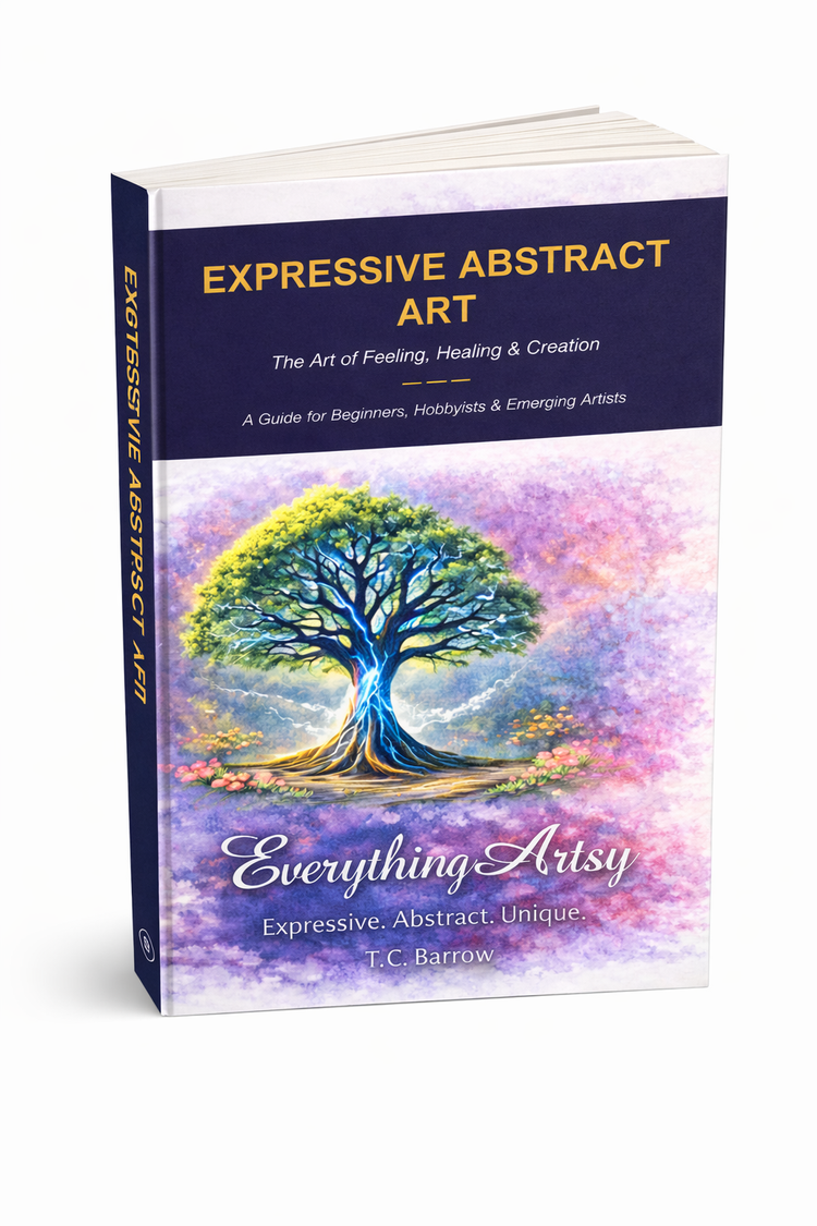
The Artist’s Library
Browse the e-book →Founding collection · Volume 01
The Intuitive Color Atlas
Unexpected Color Relationships Worth Exploring
A flash of cobalt feels different against yellow ochre than it does on bare paper. Explore a curated selection of color discoveries here. The complete collection of 60 pairings is reserved for the publications.
Explore the Intuitive Color Atlas · First discovery
Cobalt Blue Meets Yellow Ochre
Give blue most of the page and run a narrow band of ochre along one edge. Now reverse the proportions. Where does your eye settle? Try a broken edge or a transparent layer, and keep the study that surprises you.
A first look · Illustrative digital pairings